The Moving Average (MA) charts are another alternative to the preceding Shewhart type control charts (X-Bar R and I-R charts in particular) and are most useful for detecting small shifts in the process mean. It uses a single sample/subgroup, same as our standard Individual-Range, and EWMA charts. The MA chart use a moving average, where the previous (N-1) sample values of the process variable are averaged together along with the current process value to produce a smoothed stand-in for the current process variable. This helps to “smooth” the incoming data, minimizing the affect of random noise on the process. Unlike the EWMA chart, the MA chart weights the current and previous (N-1) values equally in the average. While the MA chart can often detect small changes in the process mean faster than the Shewhart chart types, it is generally considered inferior to the EWMA chart. Like the Shewhart charts, if the MA value exceeds the calculated control limits, the process is considered out of control. Note that the limits are variable (wider) at the beginning, taking into account the fewer samples in the start up of any type of SPC chart which uses a sliding window in the calculation of moving average and moving range statistics.
The MA (Moving Average) chart can be used alone, with no secondary chart. There are two other related charts, the MA-MR chart, and the MA-MS chart. The MA-MR (Moving Average – Moving Range) chart, uses two charts, where the primary chart is the MA chart described above, and the secondary chart is a Moving Range chart. When calculating the Moving Range, it windows the same data values used in the Moving Average calculation.
The MA-MS (Moving Average – Moving Sigma) chart, also uses two charts, where the primary chart is the MA chart described above, and the secondary chart is a Moving Sigma chart. When calculating the Moving Sigma, it windows the same data values used in the Moving Average calculation.
MA Chart – 1
The data used in the chart is pulled from the SPC chart example, Table 9-1, in the textbook Introduction to Statistical Quality Control 7th Edition, by Douglas Montgomery.
.
Instead of comparing the actual sampled value of each interval to the current control limits, the MA chart calculates a stand-in value which is a average of current and past values. The current value \(z_i \) , for a MA chart is calculated as a weighted moving average of the N most recent samples. The formula for this calculation is:
\(\large{ Z_i = \frac{(X_i + X_{i-1} + X_{i-2} + … X_{i-N+1})}{N}} \)
where \( X_i \) is the sample value for time interval i, and N is the length of the moving average.
When calculating the moving average values for the first N-1 sample intervals, there is no look back beyond the start of the data, so the moving average will be truncated to length 1, 2…N-1 until a full window N values are available to calculate the moving average.
The initial setup of the chart typically involves establishing standardized control UCL (Upper Control Limit) and LCL (Lower Control Limit), and Target (Centerline) values, for the MA chart. These limits are calculated based on monitoring and sampling the process when it is running while “in control”. The formulas for MA charts are listed below.
Calculate the \(\mu_0\) value as the mean of the actual data values. Let (\(X_1, X_2, …, X_N\)) be the measurement values of the N sample intervals. Or you can use a \(\mu_0\) value that you know from previous runs.
The standard deviation value (\(\sigma\) for the process is calculated using the sample standard deviation formula, seen below. Or you can use a \(\sigma\) value that you know from previous runs.
\(\Large {\sigma = \sqrt{\frac{\sum_{i=1}^N X_i – \bar x}{N-1} }}\)Assume that the test data in the chart above is such a run. You will find the raw sample data (1 sample per subinterval, 30 sample intervals (N)) in the table section of the chart below in the Sample row. The MA row shows the calculated MA values(\(Z_i \)) value for each sample interval.
Control Limits for the MA chart
\(\Large{UCL= \mu_0 + 3 * \frac{\sigma}{\sqrt{M}}}\) \(\Large{Target =\mu_0} \) \(\Large{LCL= \mu_0 – 3 * \frac{\sigma}{\sqrt{M}}}\) \(\mu_0\) is the process mean\(\sigma\) is the process standard deviation, also known as sigma
M is the length of the moving average used to calculate the current chart value
MA Chart – 2 (Interactive)
Setup Values: M = Moving Average length=5,
The Target value is calculated as the mean of the raw data: \(\mu_0=10.315\)
The \(\sigma\) value used in the UCL and LCL calculations is calculated as the standard deviation of the raw data: \(\sigma=1.154\)
The initial chart represents a sample run where the process is considered to be in control. Therefore it is a suitable source of data to calculate the UCL, LCL and Target control limits. The control limit lines and values displayed in the chart are a result these calculations. What you don’t want to do is constantly recalculate control limits based on current data. Because once the process goes out of control, you will be incorporating these new, out of control values, into the control limit calculations, which will widen the control limits. Instead, as you move forward, you apply the previously calculated control limits to the new sampled data. When the process starts to go out of control, it should produce alarms when compared to the control limits calculated when the process was in control. You can simulate this using the interactive chart above.
When you select the Simulate Data button in the Individual-Range Chart-2 chart above, the dialog below appears:
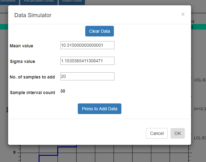
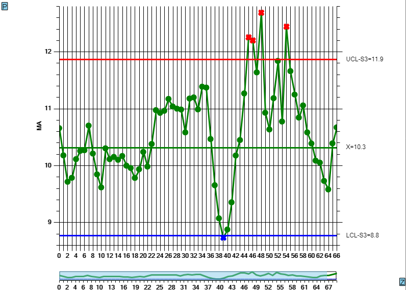
What it shows for the Mean value and Sigma value are the values calculated based on the current data. So if you simulate new sample intervals using these values, the result will be that the new values look like the old, and the process will continue to stay within limits. Even using these values, you will, however, get a random control limit violation every once in a while. This is known as a false positive (alarm) and it is due to the probabilistic nature of SPC control charts. See the section on Average Run Length (ARL) for more details. But if you modify the Mean and/or the Sigma value slightly, you increase the odds, above that of the ARL value, that process exceeds the pre-established control limits and generates an alarm. So change the Mean value to 11, and the Sigma Value to 2. Now you are simulating the process has changed enough to alter the both the mean and variability of the process variable under measurement. Press the Press to Add Data button a couple of time to generated the simulated values, then exit the dialog by pressing OK. The new data values are appended to the existing data values, and you should be able to see the change starting at the 20th sample interval. Use the scrollbar at the bottom of the chart to scroll to the start of the simulated data. The picture below displays the simulation. Your picture may not look exactly the same, because the simulated data values are randomized, and your randomized simulation data will not match the values in the picture. But the general idea will be the same. You find a more generalized, and detailed discussion of how to work with the Interactive charts here:
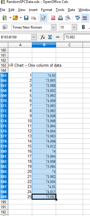
If you want to try and plot your own data in the MA chart, you should be able to do so using the Import Data option of the Interactive chart. Organize your data in a spreadsheet, where the rows represent sample intervals. Since this an MA chart, there should only be one column, representing one sample value per sample interval. Make sure you only highlight the actual data values, not row or column headings, as in the example below.
Copy the rectangle of data values from the spreadsheet and Paste them into the Data input box. By default, data values copied from a spreadsheet should be column delimited with the TAB character, and row delimited with the LF (LineFeed) character. In the case of a single column, there will be no TAB character, just the LF character delineating each new row.
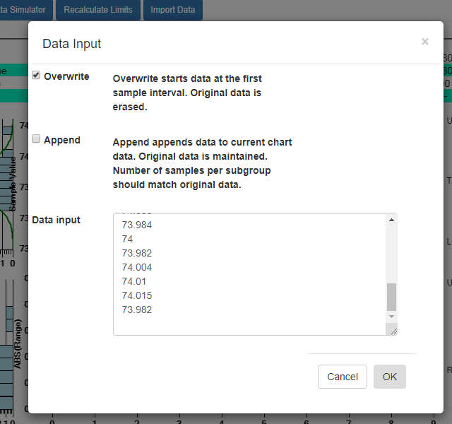
Select OK, and if the data parses properly you should see the resulting data in the chart. By default, data entered into the Data input box overwrites all of the existing data. That way you can create your own custom Individual-Range chart, using only your own data. You start by entering in a batch of data from an “in control” run of your process, and display the data in a new chart. Calculate new control limits based on this data, using the Recalculate Limits button. Should you want to enter in another batch of actual data from a recent run, and append it to the original data, go back to the Import Data menu option. This time select the Append checkbox instead of the default Overwrite data checkbox.
MA-MR Chart
The MA-MR chart adds a moving range graph as the secondary chart to the MA chart already described. Similar to the Range calculation in the I-R chart, the MR chart calculates a Range value for each sample interval by windowing the same data values used in the Moving Average calculation. Where the length of the window is always 2 in the I-R chart, in the MA-MR chart it is M, the length of the moving average window.
Control Limits for the MR part of the MA-MR chart
\(\Large{UCL= R + D_4 * R} \) \(\Large{Target =\bar{R}} \) \(\Large{LCL= 0}\) \(\bar{R}\) is the average of the moving average ranges\(D_4\) is a constant, dependent on the moving average window length M, tabulated in the XBar-R Chart page.
M is the length of the moving average used to calculate the current chart value
MA-MR Chart (Interactive)
Setup Values: M = Moving Average length=5
MA-MS Chart
The MA-MS chart adds a moving sigma graph as the secondary chart to the MA chart already described. Similar to the Sigma calculation in the XBar-Sigma chart, the MS chart calculates a Sigma value for each sample interval by windowing the same data values used in the Moving Average calculation. Where the length of the window is subgroup sample size in the XBar-Sigma chart, in the MA-MS chart it is M, the length of the moving average window.
Control Limits for the MS part of the MA-MS chart
\(\Large{UCL= B_4 * \bar{S}} \) \(\Large{Target = \bar{S}}\) \(\Large{LCL= B_3 * \bar{S}}\) \(\bar{S}\) is the average of the moving average sigma values calculated for each sample interval\(B_4\) is a constant, dependent on the moving average window length M, tabulated in the XBar-Sigma Chart page.
\(B_3\) is a constant, dependent on the moving average window length M, tabulated in the XBar-Sigma Chart page.
M is the length of the moving average used to calculate the current chart value
MA-MS Chart (Interactive)
Setup Values: M = Moving Average length=5
