Display chart in its own browser page.
QCSPCChart combines all of the elements of all of the previous SPC Charts. Based on the Quinn-Curtis QCSPCChart Apps found on the IOS, Android and UWP stores, it incorporates all of the following features:
- Variable control charts – XBar-R, XBar-Sigma, Individual-Range, Median-Range and Levey-Jennings.
- Attribute control charts for monitoring defects – (p-, np-, c-, u-, and DPMO charts).
- Automatic control limit calculations – The software will automatically calculate SPC control limits using historical data for the supported variable control and attribute control chart types.
- Advanced control rule sets – WECO, WECO + Supplemental, Nelson, Westgard, Gitlow, Hughes, Juran, AIAG, and Duncan.
- Process capability ratios – Cp, Cpk, Cpl, Cpu, Cpm and process performance indices (Pp, Ppk, Ppl, Ppu). A set of specification limits can also be added to the chart.
- SPC Charts for variable sample subgroup size – The XBar-Sigma chart, the p-chart, and the u-chart support a variable sample size per sample subgroup option.
- Integrated scrolling and zooming – The SPC charts are displayed as one or two synchronized charts, under the control of a scroll bar. The scroll bar can be replaced by an integrated zoom control which allows for the display of charts with a custom time frame. Auto-scaling of the charts y-axes keeps everything in view.
- Integrated data table – An integrated table appears above the chart, that displays information about the process under view, and each sample interval plotted in the chart. The table displays time, individual sample values, sample statistics, process indices, alarm status, and any notes entered for that sample interval.
- Data simulator – A data simulator is available by which you create add simulated data, with a known mean and variance, to a chart to test different control limit values and rule sets.
- Data input– Sample data can be entered, or edited using a sample interval editor..
- Data import – The user can manually input and edit sample data from within the program. The user can also copy/paste sample data directly from a spreadsheet.
- Customization – The user can customize the SPC chart and control limits using built-in setup forms. Both auto-calculated and manually set control limits are supported.
This software is meant to be run on a device with a minimum display resolution of approximately 1200 x 800 pixels (landscape mode) or 800 x 1200 pixels (portrait mode). Display resolutions less than that may result in clipped text on the sides of the charts, tables and setup dialogs.
Using the Chart UI
Scrolling the Chart ViewScrolling the chart view
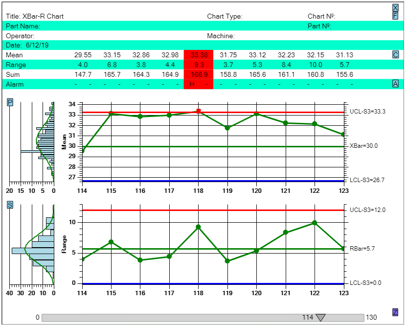
Scroll the charts, and the table above, using the scroll bar at the bottom of the display.
The initial chart shows the first 10 sample intervals of the data. As you can see, for these first samples, the chart is in control because the measured variable does not exceed the control limits. But charts will usually contain may more sample intervals, typically hundreds, and in some cases, millions. So you need to be able to view scroll the data forward and backward in time. There are two ways to do this. First you can use the default Slider found at the bottom of the chart. It can be slid to the right, all the way to the end, causing the chart to update with new data. That way you can see if at any point the measured variable exceeds the control limit.
Zoom controlled
The chart is initially limited to showing 10 sample intervals at a time. This limitation is mostly to keep the columns of the table data above the chart from overlapping. If you have a display which is significantly narrower, or wider than what we use for the default, you can change this value using the Setup | Chart Type option.
If you have hundreds, or even thousands of sample intervals, you may not want to look at only 10 at a time. It is possible to squeeze many more data points on the screen so that you have a much wider view of the data. You do this using the Zoom control. The Zoom control is enabled using the [Z] button in the lower right hand corner of the display, just above the right-top of the slider. If you select that button, the slider will displaced by a zoom control. The Zoom control is a short chart which shows an miniaturized version of the entire dataset loaded into the app. The transparent blue section (zoom box) represents the current view of the data represented by the large Primary an Secondary charts above.
[Zoom Control]
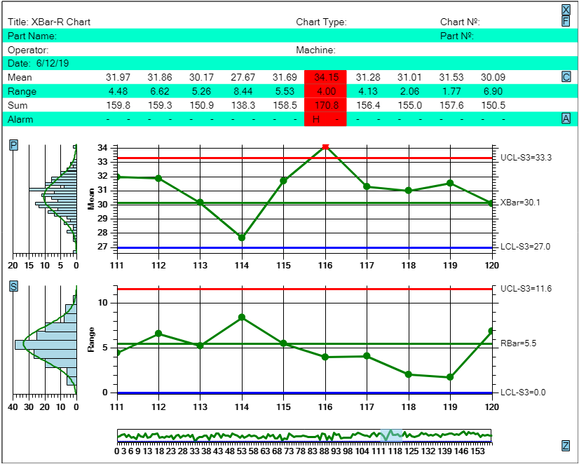
The user can change the time scale (the number of data points) of the x-axis using the zoom control, using either the mouse, or by touch.
You can use the Zoom control much like the slider. If you press on the center of the zoom box, you can slide it left and right, moving the current view of the data forward and backward in time. But, you can also use it to expand the view area, You can select the left or right edge of the zoom box and drag the edge left or right, expanding or contracting the size of the zoom box. You can expand the zoom box so that all of the data is plotted in the Primary and Secondary charts above. When the zoom box is expanded to where it contains more sample intervals than the initial default value for the width of the zoom box, the table above the charts is turned off, so that the columns to do not overlap.
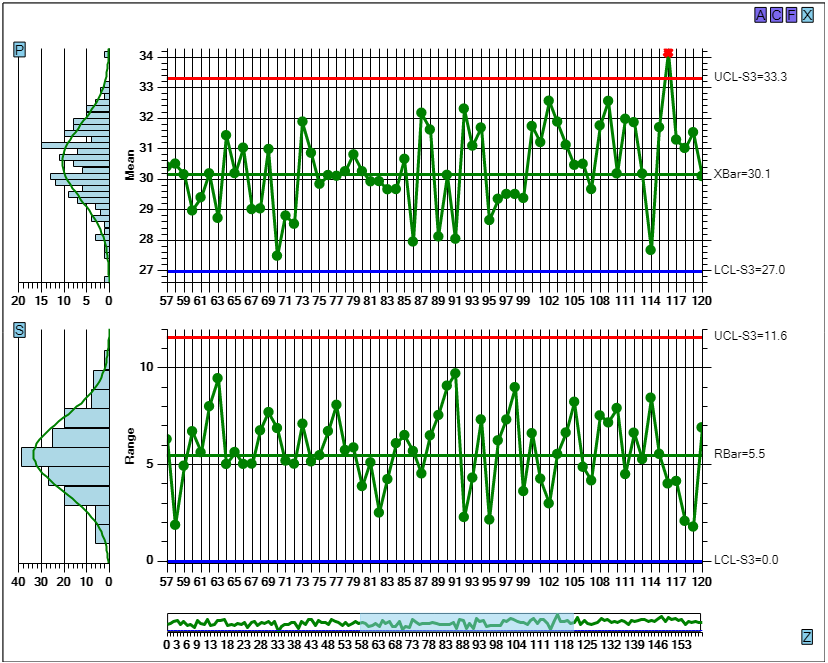
A wide view of the data makes it easier to spot trends.
Alternative UI method for defining the zoom box – Sometimes the combination of small devices and large fingers make selecting the edge of the zoom box difficult, resulting in erratic results when trying to adjust the zoom box width. In that case, just press in the zoom graph area near the top, at the x-position you want to start at, and drag your finger (or mouse) down and to the right, ending at the x-position you want to end at. The zoom box will jump to those starting and ending x-coordinates and update the Primary and Secondary charts accordingly. Don’t start the press and drag operation inside or near the edge of the current zoom box, because then you will select and drag the box instead of defining a completely new zoom box.
Press the Zoom button [Z] while in the zoom mode and you will return to slider control, with the data table, displaying the same number of points you had when you entered the Zoom mode.
SPC Chart Areas
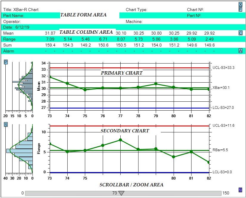
The display area is broken down into six different areas: Title, Table form, Table data, Primary chart, Secondary chart and the Scrollbar/zoom area.
There are several different areas of an SPC Chart. There is the Title and Menu area at the top, which is small but unchanging. Then there is the Table Form area, which displays descriptive information and notes you can enter concerning the current SPC chart as a whole. Followed by the Table data column area, which displays data specific to each sample interval of the current chart. Each sample interval is represented as a column in the table. Each row in the data column area represents a specific piece of information about the sample interval you might want to know. The individual samples values can be found there, and also calculated summary information used in the chart, such as the sample interval mean, range, sigma and sum. Following that are other rows for Cpk and Ppk values, alarm status, and notes for individual sample intervals.
Under that is the chart area, that normally contains one or two charts (and associated histogram plots to the left), where the measured variable is plotted as a line-marker plot, and control limit lines are plotted as horizontal lines across the width of the chart. Some SPC chart types use two charts (Primary and Secondary) and others use just one. If two charts displayed, then the top most one is the Primary chart, and the one underneath is the Secondary chart. If one chart is displayed, then it is the Primary chart.
At the very bottom you have either the scrollbar, or zoom control.
There is much information to show in an SPC chart, in the limited are of a mobile device display. How much room is devoted to each SPC chart area (Table Form data, Table Row data, Primary chart, Secondary chart, is a trade off on what data you need to see at any particular time. In order to maximize the utility, the different SPC chart areas can be collapsed using small buttons on the left and right sides of the display, to so that the other SPC chart areas can use the saved space.
Collapsible Charts and Table Rows
The small, single letter, buttons on the left and right side of the display toggle on and off the SPC chart display areas. The button letters are meant to be simple mnemonics for the SPC chart area they are meant to control. The English version of these buttons are seen in the picture below. If any of the buttons are pressed, they toggle on and off the SPC chart area they are associated with. For example, if you press the [S] button on the left of the Secondary chart, you will turn off the secondary chart area. The primary chart will then grow in height to fill in the space where the secondary chart was. You can do the same with the primary chart. If you press the [P] button to the left of the Primary chart, you wlll remove it from the display, and the secondary chart will fill the space where the primary chart was. If a chart area is turned off, the [P] and [S] chart buttons relocate to the bottom left of the display, above the slider or zoom control. If you press them again, the charts will reappear in their original location.
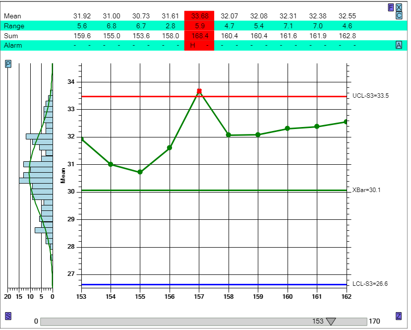
The buttons on the left and right edges of the chart make it easy to collapse parts of the display, making it easy to customize the display.
The buttons to the right of the Table area rows will collapse the associated Table row area, freeing up the space to be used by other table rows, or by the charts below. There are several row areas which can be toggle on or off, and the letter assigned to them is a meant as a rough mnemonic for the category the row belongs to.
Button Table Areas
[F] Table Form AreasTable Row Data Areas
[T] Time row [S] Samples row [C] Calculated value row (mean, range, sigma, sum) [P] Process Measurement Indices (Cpk, Ppk, Cp, Pp) [A] Alarms [N] NotesChart Area
[P] Primary chart [S] Secondary chart [Z] ZoomThere is also an [X] button, on in the upper right under the Title area. It should not be confused with the traditional Close button, which is not normally found in mobile applications. Instead it toggles on and off All of the Form Table and Row Data areas at once. So if you want to have the charts occupy the entire display, press the [X] button. Depending on what intermediate state the Row options are in, you may have to press it twice to toggle all of the Table data on or off.
In addition to the buttons, there are a several UI features found in the Chart and Table areas. A simple popup tooltip displays if you press on a data point in one of the charts. There you can get the current time, and sample values associated with a sample interval. It is most useful if you have collapsed the Table part of the display, otherwise it is just a repeat of the data found there. If you press on an item in the Notes row marked with “Y”, you will see a popup of a note that was entered for that sample interval. And if you press on an item in the Alarm row, when that item is marked as being in alarm, a summary of what SPC chart violation caused the alarm is displayed in a popup window.
In the pull-down sections below you find descriptions of the QCSPCChart web app setup options. There are nine options, divided into three groups you can select from the navigation bar. Click on any of the items below to see a full description.

Setup
Chart Type - Specify the SPC chart type and sample size for the chart.Chart Type
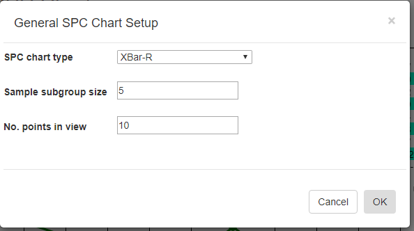
SPC chart type [XBar-R] – select any of the standard SPC chart types: XBar-R, XBar-Sigma, I-R, p-chart, np-chart, c-chart or u-chart.
Sample subgroup size [5]- set the sample subgroup size. If you change the sample subgroup size from the default you should clear the data and simulate new data so that the data uses the new sample subgroup size
Number of points in view[10] – sets the number of sample intervals displayed at a time in the charts and table.
Table Options
The text used in the Form area (topmost) part of the table may not match your application, so you can customize the table captions using these options.
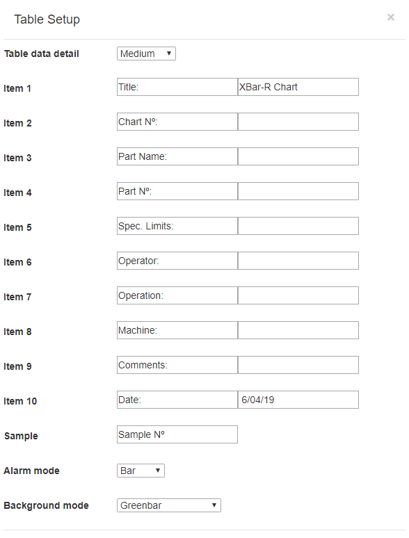
The Table setup form specifies the text (strings) used for the Table form captions and data. It also specifies which Process indices you want displayed in the Table data area.
Form data [Minimal] – There can be up to four lines of information about the chart at the top of the display. Use this list box to pick how many lines are displayed.
- None – No lines of form data are displayed
- Minimal – Two lines of form data are displayed separated into the following default items: Title, Chart Type, Rules, Chart No., Date and Comments.
- Medium – Three lines of form data are displayed separated into the follow default items: (all of the items listed under Minimal), plus the items Part Name, Part No., and Spec Limits.
- Maximum – Four lines of form data are displayed separated into the follow default items (all of the items listed under Minimal and Medium) plus the items Operator, Operation and Machine.
The item captions ( Title, Chart Type, Rules, Chart No., Date and Comments, etc.) are not fixed, and can be changed to any text that you want, to match the information you want displayed in the SPC Chart for your process.
Items 1 to 10 – Each item has a default caption and following text. In most of the fields the default form text value is blank. The default captions, which are culture dependent, can be changed to anything that you want.
Default Caption Default Form Text
- Item 1 Title: [SPC Control Chart]
- Item 2 Chart Nº:
- Item 3 Part Name:
- Item 4 Part Nº:
- Item 5 Spec. Limits:
- Item 6 Operator: [Joe King]
- Item 7 Operation:
- Item 8 Machine:
- Item 9 Comments:
- Item 10 Date: [Today’s date, you can change]
Sample [Sample No.:] – If the Samples rows are turned on in the column data part of the table, The caption Samples No. appears as the row header for each sample row. The words “Sample No.” can be changed to anything that you want.
Date/Time Format [] – The default value for the time stamp column is a simple hour:minutes 24-hour format (15:23 for example). If this box if left blank, that format is used. You can change the format to any valid date/time format using the sample interval time stamp Year, Month, Day, Hour, Minute and Second. The format is specified using a string which follows the standard Microsoft date/time formatting rules, which you can study on their web site at: https://docs.microsoft.com/en-us/dotnet/standard/base-types/custom-date-and-time-format-strings.
Here are some common date/time formats you might want to try.
Format Example Description
- H:mm:ss 23:12:23 24 hour:minute:seconds
- h:mm:ss 11:12:23 12 hour:minute:second
- H 23 24-hour
- M/dd/yy 7/19/18 Month/day/ 2-digit year
- M/dd/yyyy 7/19/2018 Month/day/ 4-digit year
- d/MM/yy 19/07/18 day/Month/ 2-digit year
- H:mm:ss d/M/yy 23:12:23 19/7/18 24-H:min:sec day/Month/ 2-digit year
- H:mm M/dd/yy 23:12 7/19/18 24-H:min Month/day/ 2-digit year
Important consideration – The resulting time stamp must fit within the column width of the table, which is normally sized to a width of 6-10 characters. If you specify a format string which uses too much space (H:mm:ss d/M/yyyy for example), the time stamp columns of the table will overlap. The only solution to this issue to reduce the number of sample intervals shown on the screen at once, using the Chart Type setup page, property Nº of points in view. Or you can specify a date/time format string that isn’t as wide.
Alarm mode [Bar]
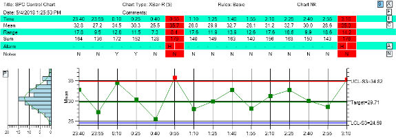
The column in the Table data area, representing a sample interval, can be highlighted so that you take notice.
When a sample interval violates the specified control limits it is considered to be in alarm. Use the Table alarm mode option to set which emphasis mode you want for highlighting the table column data when an alarm occurs in the associated sample interval. The emphasis has can take following forms:
- Text – The normally black text for the column can will changed to the alarm color
- Bar – A semi-transparent box, filled in the color associated with the alarm, is overlaid over the column text
- Outline – A rectangle (the outline of the Bar in the previous option) is drawn around the column text
- None – Use the None option if you do not want any alarm highlighting in the Table column data area.

The column in the Table data area can be highlighted using a solid background color, an outline box, or just a simple color change for the text in that column.
Background mode [Greenbar]
- The background area of the table can take on three modes:
- Greenbar Alternating green and white bars. See above for an example.
- Plain white A simple white background.
- White with grid lines A white background with a grid. See below for an example.

\The background for the table rows can use alternating colors (white and green), a plain white, and a white with grid lines.
Chart Options - Customize the charts.
Chart Options
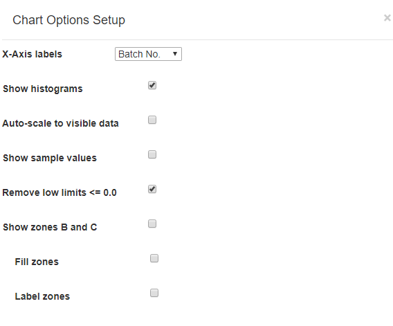
Chart specific options, for the Primary and Secondary charts, are set using the Chart Options setup form.
In order to minimize the number of setup options, we have intentionally minimized the user control over many chart features. Chart attributes such as background colors, line colors, and thickness, bar colors, text size and colors, symbol size and colors have all been fixed at values which maximize contrast and readability across a wide range of mobile devices. Here are the chart options you can change.
X-Axis labels [Timestamp] –There are three x-axis label modes you can chose from: Timestamp, Batch ID and Batch No. Use the list box to chose which mode you want.
- Timestamp – When data is entered for a sample interval, it is required that you provide a date/time timestamp. The timestamp can be used to label the x-axis tick mark for the associated sample interval data.
- Batch ID – You can enter an optional text to identify a sample interval. The Batch ID is an simple short (3-6 characters), text descriptor which is used to mark the batch. In Batch ID mode, this text descriptor is used as the x-axis tick mark label in place of the timestamp.
- Batch No. – Each sample interval has a integer position index in the overall dataset, starting at 0 and continuing to N-1 for a dataset with N sample intervals. In Batch No. mode, this integer value is used as the x-axis tick mark label in place of the timestamp.
Show histograms [Off / On] – To the left of the Primary and Secondary charts there is a frequency histogram chart of the sample data. Turn this feature on and off using this option.

Use the Show histograms switch to turn Off/On the sample data histogram to the left of the chart.
Show sample values [Off / On] – Normally, only the mean (or median value in the case of a Median-Range chart) value is plotted for each sample interval. You can always look at the exact values for individual samples in the table column data for the sample interval. You can also display the individual sample values in the Primary chart by toggling this option On. Sample values appear with the X symbol.
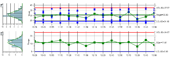
Use the Show sample values switch to turn Off/On the display of individual sample values (the X scatter plot symbols in the picture above) at each sample interval.
Remove low limits <= 0 [Off / On] – Some of the Primary charts of Attribute control charts, and the Range charts of the Variable controls charts produce control limits <= 0.0. There can be cases where you want a control limit at <=0.0, and others where you do not. In the example above this option is enabled, and it removes the control limit at 0.0 for the Secondary Range chart of an Xbar-R chart. It does not show the control limit line, limit value label on the right, and the software does not evaluate the control limit when checking for control violations.
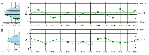
Many times the low control limit (LCL) is calculated as <= 0.0 in Variable and Attribute control charts. If you do not want that limit to show, at the 0.0 value, set the Remove low limits switch to Off.
Show zones B and C [Off / On] – Use this option to turn Off/On the display of control lines for ±2 Sigma level and the ±1 Sigma Level.

SPC chart users, particularly those using name control rules such as the Western Electric (WECO) rules, want to see the +-2 sigma and +-1 sigma control lines, because they are often used in control rule evaluation.
SPC Charts using Basic Rules normally show control lines at the ±3 Sigma limit levels. However, many users like to also see control lines for the ±2 Sigma and ± 1 Sigma level. The banded area between +2 Sigma and +3 Sigma (and -2 Sigma and -3 Sigma) is often referred to as Zone A. The banded area between +1 Sigma and +2 Sigma (and -1 Sigma and -2 Sigma) is referred to as Zone B. And the banded area between the target line and +1 Sigma (and the target line and -1 Sigma) is referred to as Zone C.
Important Note – If you select the WECO or WECO + SUPP. Control rule option in the Control Limits Setup section, control lines at ±1 and ±2 sigma are automatically enabled, since the WECO control rules explicitly use those limit levels in alarm calculations.
Fill zones [Off / On] – Fill the area between the control lines (representing Zones A, B and C) with a semi-transparent color.

SPC chart users often like to see the A, B and C control zones filled in with a transparent color.
Label zones B and C [Off / On] – The values of the control lines at ±3 Sigma are always labeled next to the y-axis on the right hand side of the Primary and Secondary charts. But you can turn Off/On the labeling of control lines at ±1 and ±2 Sigma. If you label the interior controls lines, and the control lines are close together, this can cause the labels to overlap, which will make them hard to read.
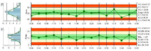
Small charts and many control lines can lead to overlap of the limit labels used on the right-hand side of the chart. So, you can leave the lines in place, and just turn off the interior (+-2 and +-1 sigma) limit line labels.
DPMO charts use an important parameter known is the defect opportunites per unit. The default value for the parameter is 1. So if you are using 1 as the the value of defect opportunites per unit in your chart, you don’t need to do anything. If your value is greater than 1, you need to specify that in using this property. If the current chart type is not a DPMO chart this field will not display in the setup dialog.
Defect Opportunities per unit (DPMO) [1]
DPMO charts use an important parameter known is the defect opportunites per unit. The default value for the parameter is 1. So if you are using 1 as the the value of defect opportunites per unit in your chart, you don’t need to do anything. If your value is greater than 1, you need to specify that in using this property. If the current chart type is not a DPMO chart this field will not display in the setup dialog.
Limits
Control Limits - Specify control limits, either manual or auto-calculated.Control Limits
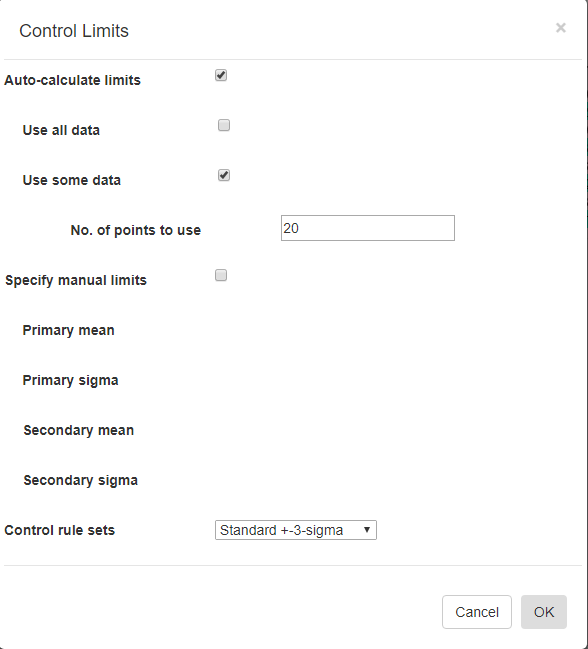
Auto-Calculate limits [Off/On] – Every SPC chart type has a unique way of calculating control limits. Turn this switch On if you want the software to calculate the control limits based on your current data. This option is mutually exclusive with the Specify manual control limits option below.
Use all data [Off/On] – You can use all of the data in the current dataset to calculated the control limits to apply to the dataset. This option is mutually exclusive with the Use some data option below.
Use some data [Off/On] – You can limit the data used in the Auto-Calculate control limits calculation. For example, you can calculate the control limits using the first 20 sample intervals of your dataset, and apply the limits to the remaining intervals of your dataset. This option is mutually exclusive with the Use all data option above.
Nº of points to use [20 ] – Specify the number of sample intervals, starting from the beginning of the current dataset, to use in calculating the control limits
Specify manual limits [Off/On] –You may already know your control limits, because of previously collected data for your process. In that case you can enter the control limit values directly. This option is mutually exclusive with the Auto-Calculate control limits option above.
Primary mean (or target value) [31 ] – Enter the mean value, for the Primary chart. –
Primary 3-Sigma [37.8 ] – Enter the value of the +3 Sigma control limit for the Primary chart. Make sure you enter the +3 Sigma control limit value, and not the +3 Sigma value itself. The +3 Sigma control limit value is the Primary mean (or target) value plus the +3 Sigma value.
Secondary mean (or target value) [11.5 ] – Enter the mean value, (or target value) for the Secondary chart.
Secondary 3-Sigma [4.1 ] – Enter the value of the +3 Sigma control limit for the Secondary chart. Make sure you enter the +3 Sigma control limit value, and not the +3 Sigma value itself. The +3 Sigma control limit value is the Secondary mean (or target) value plus the +3 Sigma value. Also, do not use the +3 Sigma value from the Primary chart. The Secondary chart is going to have its own, unique +3 Sigma value.
Control rule sets [Standard ±3-Sigma] – Regardless of how the control limits are set, automatic or manual, you can specify how those control limits are applied to the underlying data in order to determine whether or not an alarm condition is met. There are nine options: Standard ±3 Sigma, WECO Rules, WECO + SUPP Rules, AIAG Rules, Juran Rules, Hughes Rules, Gitlow Rules, Duncan Rules , Westgard Rules.
Performance Measures
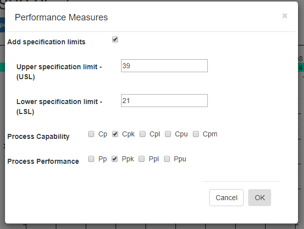
In SPC, a manufacturing process is often subject to statistical analysis to calculate a simple measure of the overall process capability and performance. The most common process measures are Cpk (a Process Capability measure) and Ppk (a Process Performance measure). The Cpk measure is generally preferred when the process is known to be in control, while the Ppk is best used if the process is not in control. Other performance measurement indices include Process Capability indices (Cp, Cpu, Cpl and Cpm) and Process Performance indices (Pp, Ppu, and Ppl).
Add specification limits – Specification limits are not the same as sigma-based control limits. The sigma-based control limits are a result of the normal variances of the machines used in the manufacturing process. Specification limits are the tolerance allowed in the finished product to decide whether or not the product meets its targeted quality goals and end-user acceptance. Normally, specification limits for a product in a Six Sigma controlled manufacturing process are going to outside of the ±3 sigma limits. Because who wants a manufacturing process which is incapable of consistently producing a product which meets the quality goals, as specified by the specification limits.
Upper Specification Limit (USL) [40]- Upper Specification limit
Lower Specification Limit (LSL) [20] – Lower Specification limit
Process Capability – Cp, Cpk, Cpl, Cpu, Cpm
Check the process capability indices you want added to the graph.
Process Performance – Pp, Ppk, Ppl, Ppu
Check the process performance indices you want added to the graph.
Data
Add/Edit Datapoints - The Add/Edit Datapoints option is the way you manually enter sample data into the app.Add/Edit Datapoints
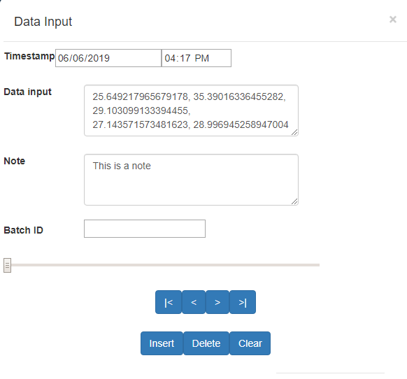
Sample data for each sample interval can be added, or edited using theAdd/Edit Data input form.
The Add/Edit Datapoints option is the way you manually enter sample data into the app. It is organized to show one sample interval, or record, at a time. At a minimum a sample record consists of a timestamp, and sample data for the sample interval. Optionally you can add a Note and a Batch ID for the sample interval.
Timestamp [Date] [Time] – Specify a date, and a time, for the sample interval by selecting both the Date picker field, and then the Time picker field.
Data input – In the Chart Type setup dialog you entered in the sample subgroup size. Here you need to enter a number of sample values to match. Since it is possible that something happened which invalidated a partiuclar value within a sample group. In that case you can enter the text “Bad_Value”, or null, for the bad data value, as in the example below. Once you enter the record into the dataset, by moving to the next record, when you go back to the record with the bad, or null value, it will always display as “Bad_Value”.
35.98141770972, 32.0709203554182, 23.060560436249, 26.6689362116945, Bad_Value
Adding data for Variable control charts
Variable control charts (Xbar-R, Xbar-Sigma, Individual Range, Median-Range, etc.) all use measurement data converted to floating point numbers. The sample subgroup size will vary from 1 to 20 or more, depending on the chart type and and process characteristics. The data examples above are specifically for a Variable control chart using a sample subgroup size of 5. The sofware will expect 5 sample values for every sample interval.
Adding data for Xbar-Sigma charts using variable sample size
If you are using an Xbar-Sigma chart type, and also want to use variable sample size (set in the Control Limits section), just enter in the sample values you have for each sample interval. For example, if you have selected the Xbar-Sigma chart type in the Chart Type setup section, with a default value of 5 for the Sample Subgroup Size, you can still enter in 7 values for the sample interval data. The software will use a sample size of 7 when calculating the control limits for that sample interval, resulting in tighter control limits around that sample interval
35.98141770972, 32.0709203554182, 23.060560436249, 26.6689362116945, 31.876451770972, 28.8756703554182, 29.237650436249
If you enter in fewer values for the sample interval, 4 for example, the limits will be looser.
26.6689362116945, 31.876451770972, 28.8756703554182, 29.237650436249
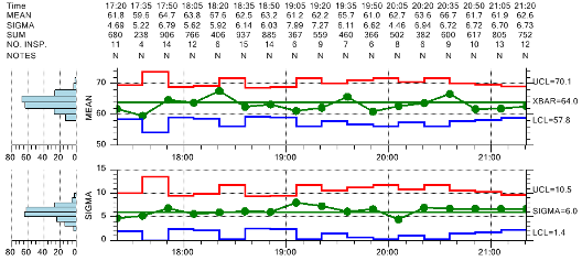
X-Bar Sigma Chart with variable sample size
Adding data for Attribute control charts
Attribute control charts (p-chart, u-chart, np-chart, c-chart, DPMO-chart) are different than Variable control charts. In those cases, a sampled product will have one or more defects, and this is a binary (true/false) property. In practice, a batch of product is pulled out for testing. For example, a 100 or more products are separated out for testing, and 100 would considered the sample subgroup size. Then the defects within that sample group are counted. There are two ways to count the defects, depending on the Attribue control chart type. In the p-chart, and np-chart, the number of defects are counted, regardless of whether a part as more than one defect. In the u-chart, c-chart and DPMO-chart, the number of defective parts are counted. If one part has ten defects, that still counts only one one defective part. Only the total (either number of defects, or number of defective parts) is entered as a value in the SPC chart dataset. And that total will always be an integer value. So, even though the sample subgroup size is 100, you only enter one whole number value, the defect number. So, if you are creating an Attribute control chart, the data editor will always show one value per sample interval, which is an integer measure of defects for that sample interval.
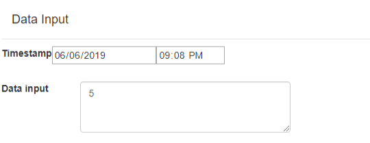
The attribute control charts only use a single data value for each sample interval.
In the example above, 5 defects (or defective parts) were entered for the sample interval. Even though the sample subgroup size for this Attribute control chart may be 100, you still only enter one value.
Adding data for p-charts, and the u-chart using variable sample size
If you are using an p-chart (Percentage or Fraction number of defects) chart type, and also want to use variable sample size (set in the Control Limits section), enter in the defect value you have for each sample interval, followed by a comma and the number of samples used in that sample interval. For example, if you have selected the p-chart chart type in the Chart Type setup section, with a default value of 100 for the Sample Subgroup Size, you can enter 5, followed by a sample size of 120. The software will use a sample size of 70 when calculating the control limits for that sample interval, resulting in tighter control limits around that sample interval
5, 120
If you enter in fewer values for the sample interval, 70 for example, the limits will be loser.
5, 70
If you do not enter a second value, representing the sample size for that interval, the software uses the default value for sample subgroup size set in the Chart Type setup section.
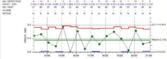
Fraction Defective Parts (p-Chart) with variable sample size
Note – There may significant event during the sample interval which needs explaining. You can enter that in the Notes field.
Batch ID
Under the Chart Options dialog, you specified the x-axis labeling mode: timestamp, Batch ID, or Batch No. If you selected Batch ID, the value of this field will show up on the tick mark of the x-axis associated with this sample interval.
[Scrollbar]
You quickly scroll to any sample interval using the scrollbar.
[|<] [<] [>] [>|] [Insert] [Delete] [Clear all data]where:
[|<] Move to the first record in the dataset
[<] Move one record earlier in time
[>] Move one record later in time
[>|] Move to the last record in the dataset
[Insert] Insert a blank record at the current location
[Delete] Delete the current record
[Clear data] Clear (reset to empty) the current dataset
Data Simulator
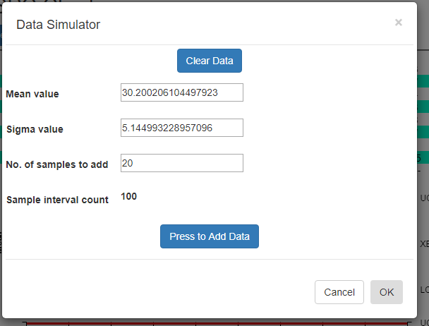
Using the data simulator you can create a randomized dataset for simulated process using just a few parameters. Since the simulated sample data needs to match the [Sample subgroup size] property entered in the SPC Chart Type Setup option, it uses that value when simulating the data.
Difference between Variable and Attribute control charts
The data simulator will automatically take into account whether your SPC chart type is a Variable control chart, or an Attribute control chart. If the chart is a Variable control chart, then N floating point sample values are simulated per sample interval, where N is the sample subgroup size. If the chart is an Attribute control chart, then 1 defect value is simulated for each sample interval, regardless of the sample subgroup size.
[Clear all data] – If you want to start with a empty dataset, select the Clear all data button.
Mean value [30 ] – Enter the mean value you want for the measurement variable. The simulator creates a sample subgroup with randomized values approximating the mean. If you are displaying an Attribute control chart, pick a mean value for defects which reflects what your sample size is. For example, if the subgroup sample size is 100, you should probably have a mean defect rate of at least five to produce reasonable simulated results.
Sigma value [5 ] – Enter the sigma value you want for the measurement variable. This is the approximate sigma value (also known in statistical science as the standard deviation) of the process you want to simulate. Do not confuse this with a sigma control limit. The resulting +3 Sigma control limit is going to be approximately the [Mean value] + 3 * [Sigma value]. Similarly, the -3 Sigma control limit is going to be approximately the [Mean value] – 3 * [Sigma value].
Nº of samples to add [20 ] – Each time you press the [PRESS to add data] button, the specified number of sample intervals will be added to the current dataset. It does NOT automatically clear the dataset. Instead, what you can do is add one batch of N=20 intervals of data using one set of Mean and Sigma values, (30, 2) for example, then you can change the Mean and Sigma slightly, (32, 4) for example, and append another N=20 intervals to the first batch. When setting up the automatic control limits, you can have the software calculate the control limits based on the N =20 samples in the first batch, and watch how those limits detect the process going out of control in the N=20 samples of the second batch.
Sample interval count 50 – Non-editable. Tells you what the current sample interval count is. Each time you press the Add data button, this counter will increment by the value of the Nº of samples to add property above.
[PRESS to add data] – Each time the button is pressed, a batch of simulated sample data is added to the chart dataset. If you want to start over, select the [Clear all data] button.
Recalculate Limits
Force a recalculation of the SPC chart control limits. If one of the Named Rulesets is used that used 1-, 2- and 3-sigma limits, all of the limits are recalculated.
Import Data
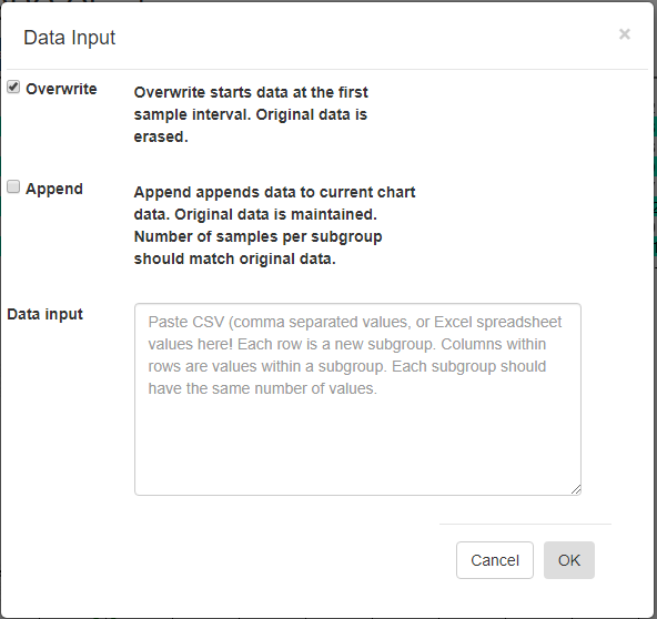
[Overwrite] – Overwrite any current data, starting with the first sample interval.
[Append] – Append data to the current charts data. Original data is maintained. The number of samples per subgroup should match the existing data.
Data input – Paste CSV (comma separated values), or Excel spreadsheet values into this box. Columns within rows are values within a subgroup. Each subgroup should have the same number of values.
If you want to try and plot your own data, you should be able to do so using the Import Data option. Organize your data in a spreadsheet, where the rows represent sample intervals and the columns represent samples within a subgroup. Make sure you only highlight the actual data values, not row or column headings, as in the example below.
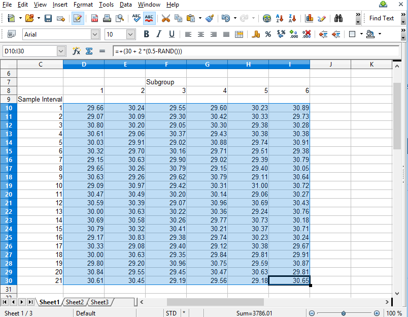
Copy the rectangle of data values from the spreadsheet and Paste them into the Data input box. By default, data values copied from a spreadsheet should be column delimited with the TAB character, and row delimited with the NEWLINE character. If so, our Data input box should be able to parse the data for chart use.
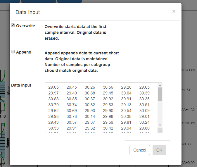
Select OK, and if the data parses properly you should see the resulting data in the chart. By default, data entered into the Data input box overwrites all of the existing data. That way you can create your own custom XBar-R chart, using only your own data. You start by entering in a batch of data
from an “in control” run of your process, and display the data in a new chart. Calculate new control limits based on this data, using the Recalculate Limits button. Should you want to enter in another batch of actual data from a recent run, and append it to the original data, go back to the Import Data menu option. This time select the Append checkbox instead of the default Overwrite data checkbox.